As you can imagine, embarking on a five-week creative residency in a foreign country, devoid of commercial obligations, proved to be a wonderful experience.
One summer’s day, I deliberately set aside time for a residency to pause, reset, and refresh my creative practice. I needed to reassess what I like to draw, explore mediums I don’t often use, and draw inspiration from new surroundings and people. And so that’s what I did, almost a year and a half later.
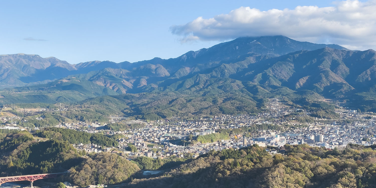
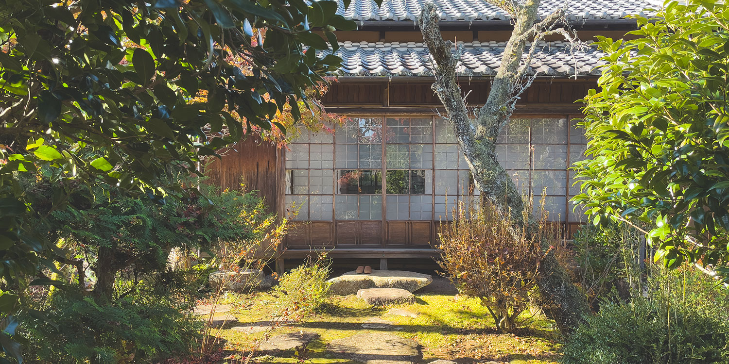
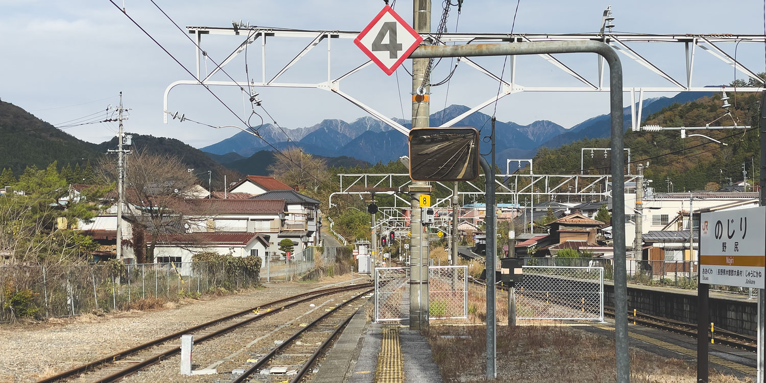
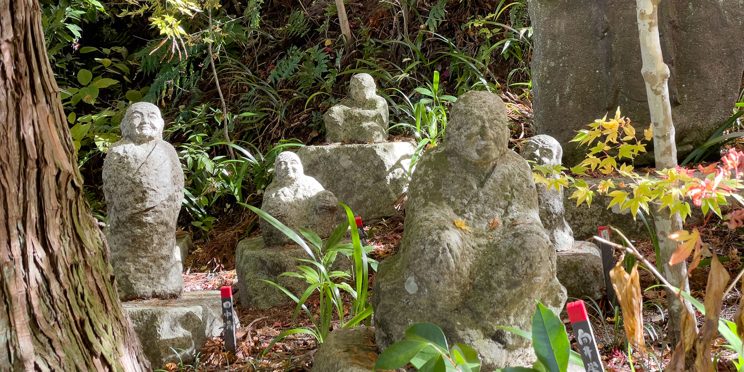
Touching down in Japan in the middle of November, and before beginning my residency at Almost Perfect, I first indulged in a leisurely week pottering around the Kiso Valley and Kyoto.
Exploring the Nakasendo trail, immersing myself in temples, shrines, and museums, and catching the stunning autumn foliage set the stage for an inspirational beginning before delving into my residency project in Tokyo.
I went in with a loose idea for the project and the sort of show I wanted to make. But this quickly proved counterproductive – I was constrained by predefined expectations, emphasising the end result rather than relishing the creative process. It needed to be about the journey, not the destination. Craving true freedom, I moved away from my commercial mindset and moved to a more explorative one. One where the direction wasn’t set in stone and allowed me to play without the pressure of thinking of the end product.
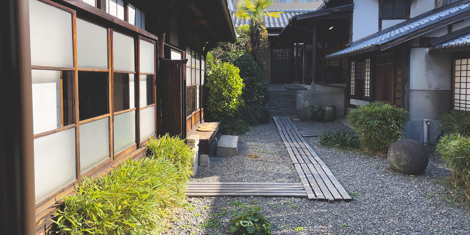
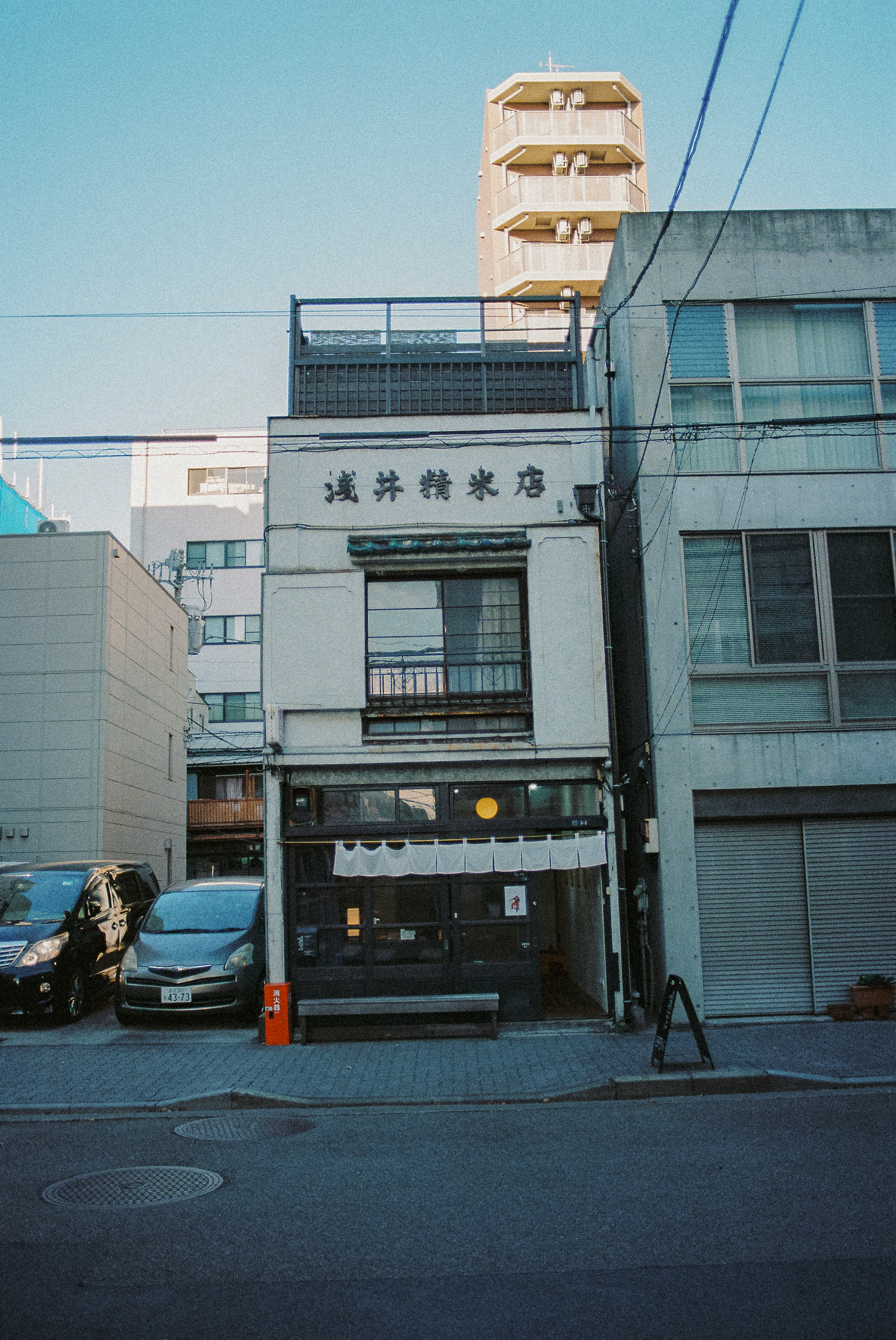
The focal point of my project revolved around Shokunin (craftsman or artisan), and the location of Almost Perfect within Taito made for easy accessibility to various professionals for me to meet. Observing and learning from these skilled practitioners allowed me to rediscover the tactile essence of my own craft.
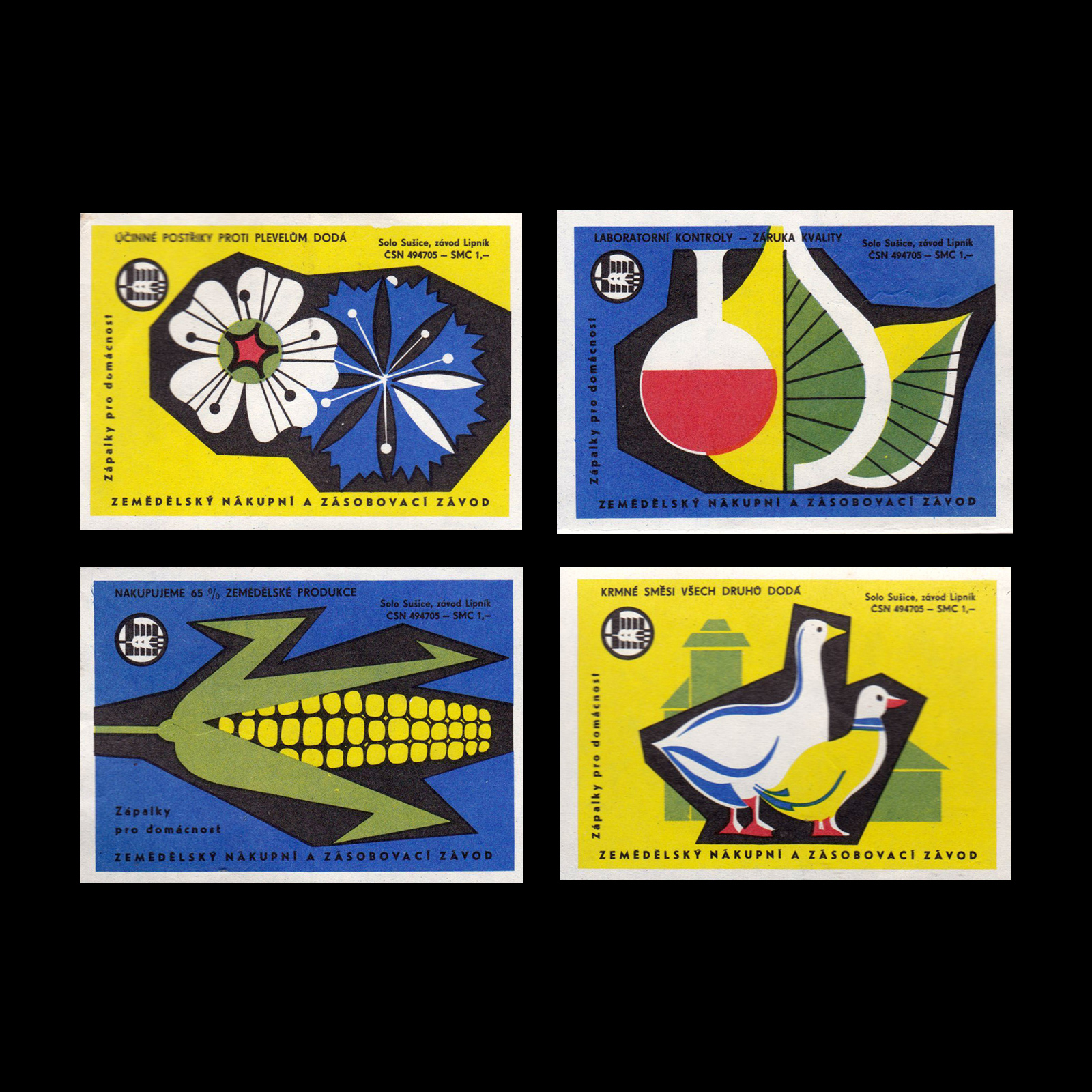
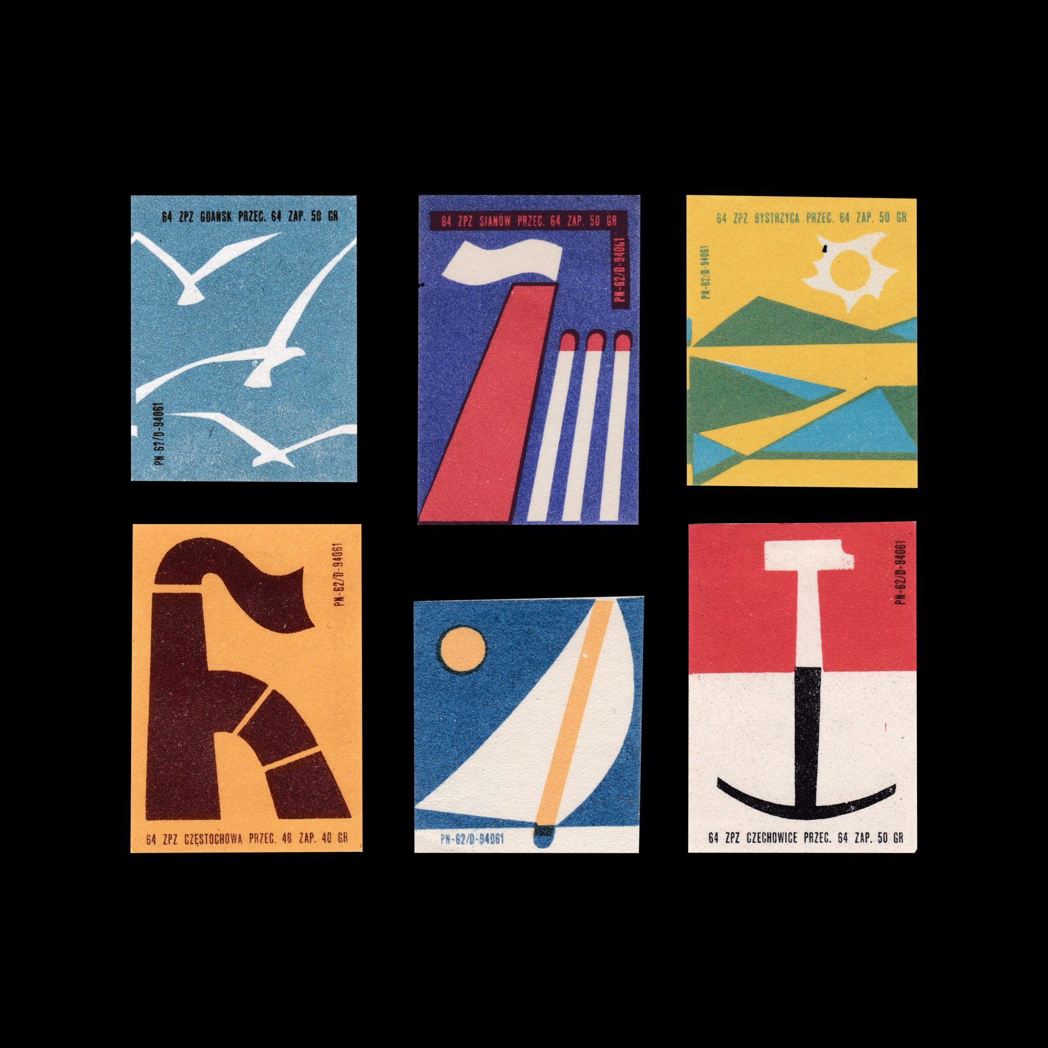
Throughout the project, I’d been looking at mid-century design, a period I often revisit for my commercial work. Not that it directly influences my illustration, but it reminds me to keep things expressive and colourful. I drew inspiration from the print design of this era, most notably matchboxes. Returning to my initial intentions of exploring traditional mediums, I settled on working with stamps. Quick, roughly-cut lino blocks where the medium’s limitations and scale made for fresh challenges and made me analyse what’s necessary, keeping my prints shape-based rather than relying on linework and detail.
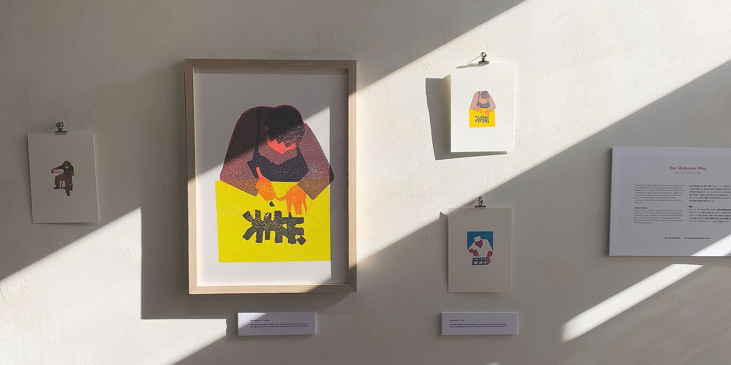
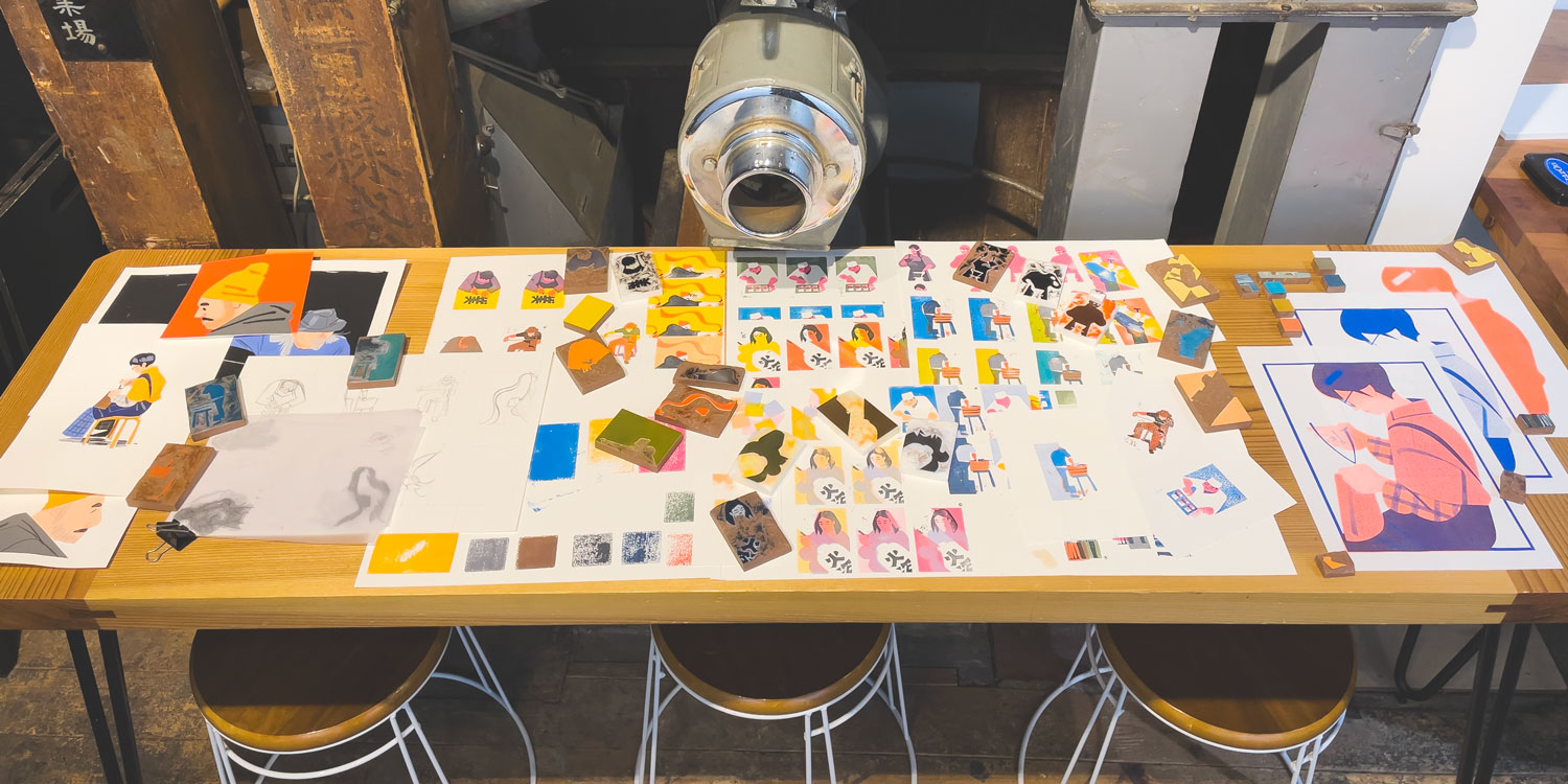
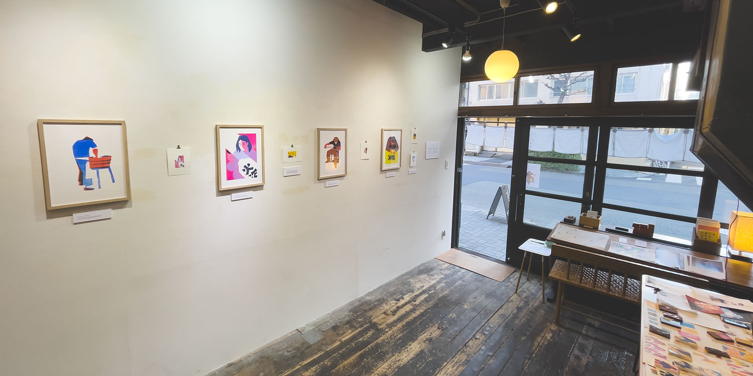
In the end, the project was the refresh I was after. I came to terms with learning to let go of my need for control and to embrace imperfections. It gave me the space to make mistakes and try out new approaches to making. And while I enjoyed the process, the work is drastically different from what I’d usually produce and won’t make an appearance in my portfolio soon; I hope to incorporate some of those methods and techniques into future illustrations and commercial jobs.
Links
Here’s a list of some lovely, talented creatives I met in Japan who you should follow:
Yan Yan Candy Ng
Sam Michell
Luis Mendo
Yuka Mendo
Ade Hogan
Jez Burrows
Matt Forsythe
Dapo Adeola
Natalie Andrewson
Nick Iluzada
Wyatt Clough
Wenyi Geng
David Robert
Azusa Tojo
Rémi Borowczyk
Nao Tokunaga
Natasha Tan
Paco Martínez
Michael Towers
Dominique Vassie
Sakura Tamagawa
Jiwon
P.S. A few months ago, I moved my newsletter over to Substack. Yet, due to questionable business decisions on their part, I’ve transitioned to a new space – a blog on my website to share updates and bits from my studio. And I can send each post as a newsletter through the magic of RSS and Buttondown.